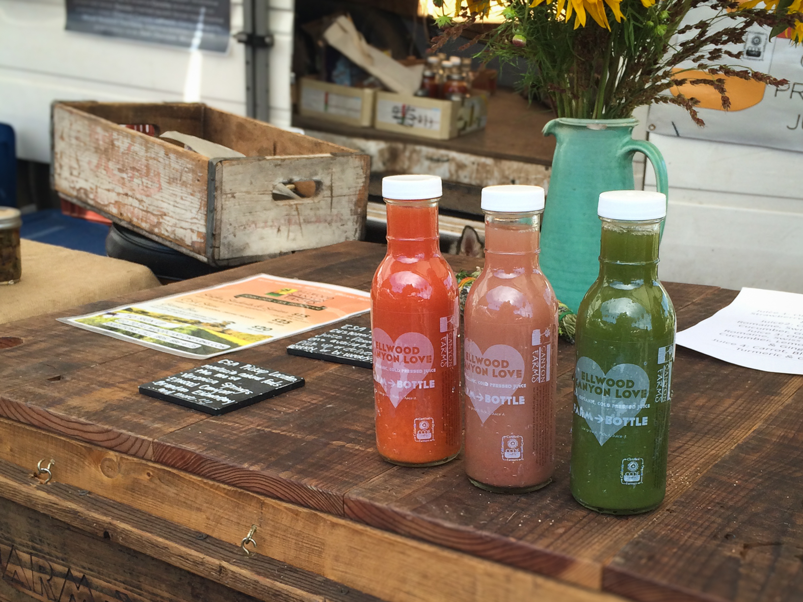
Role: Designer, Ellwood Canyon Farms
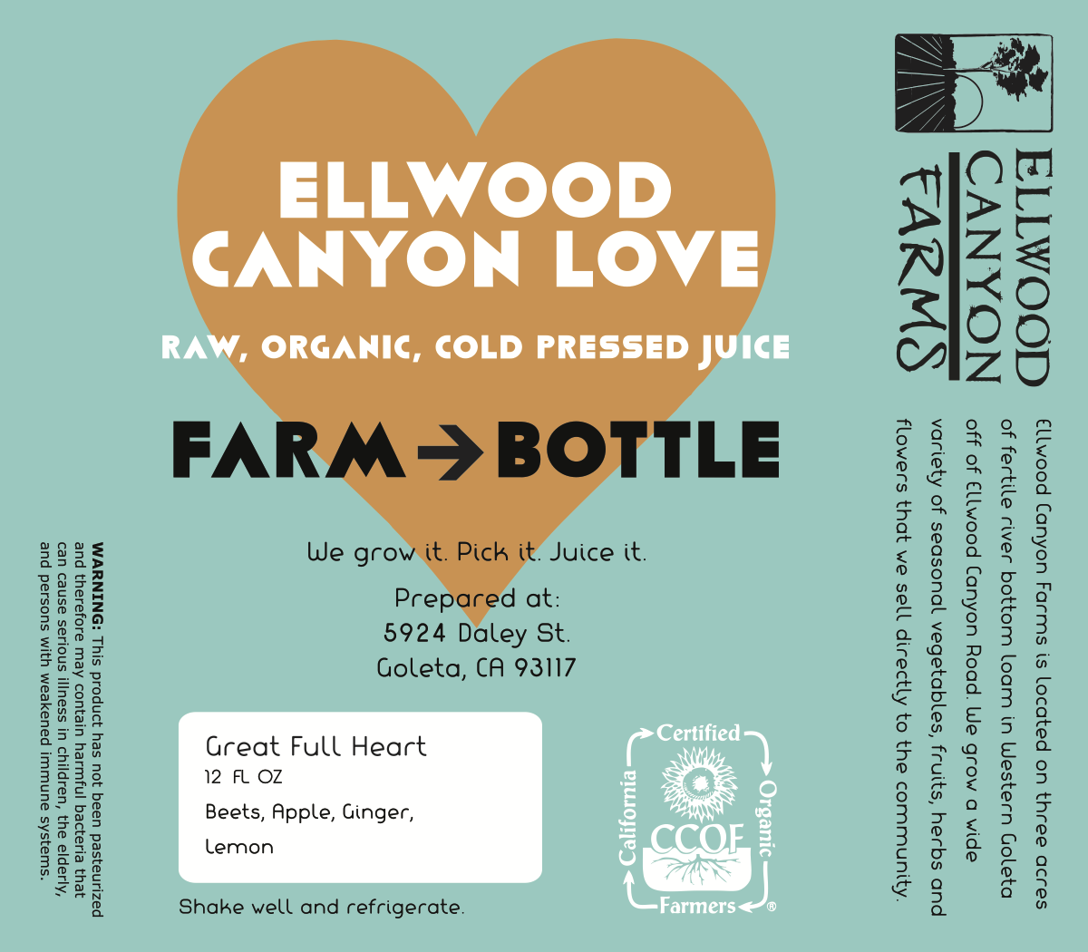
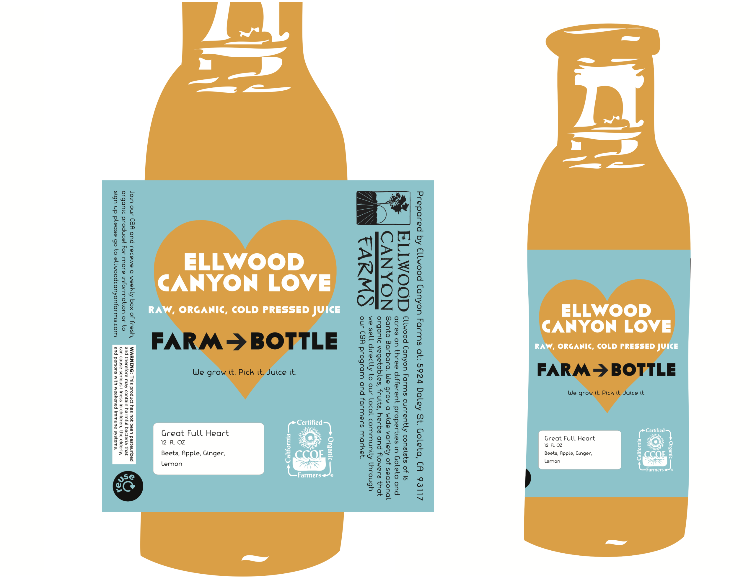
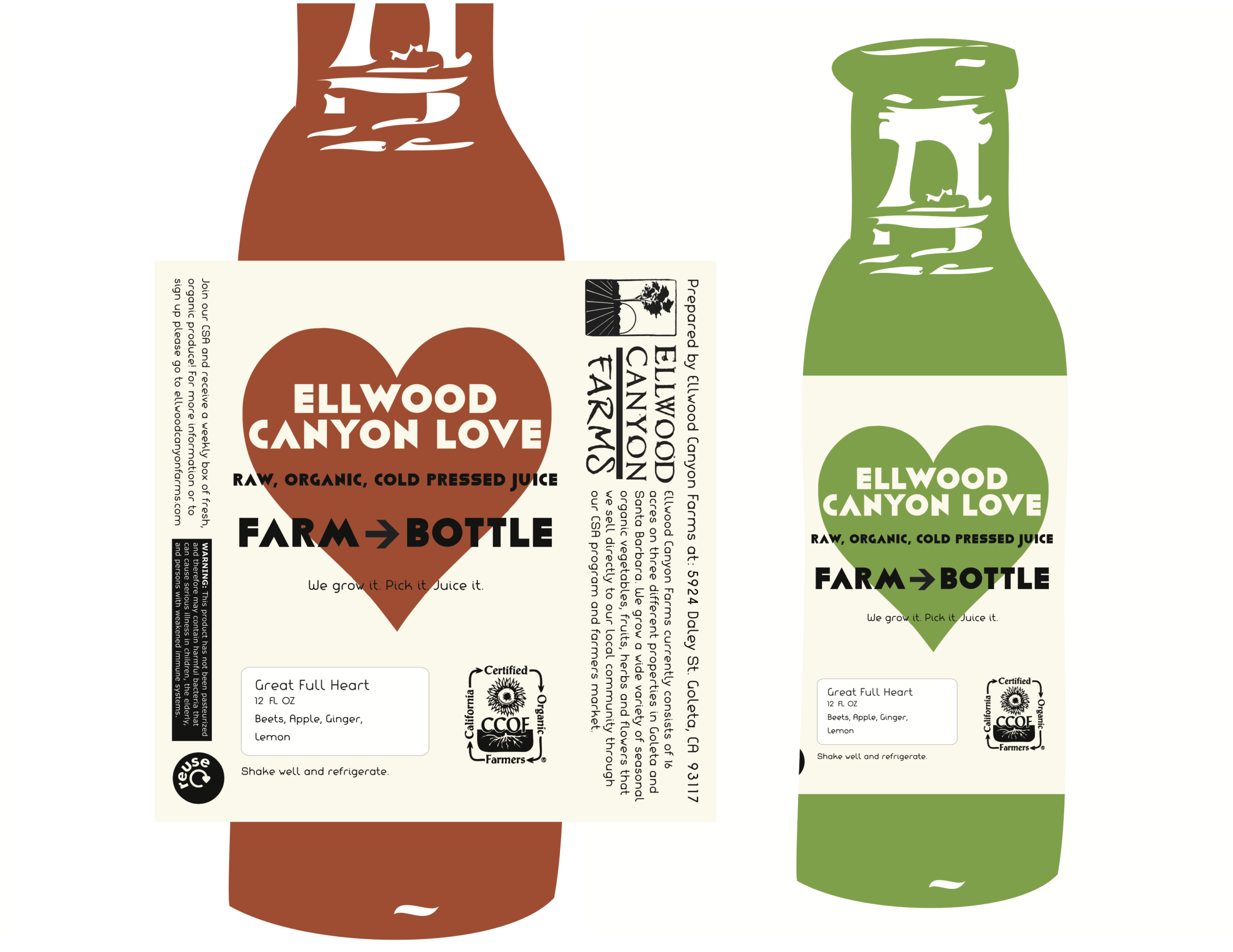
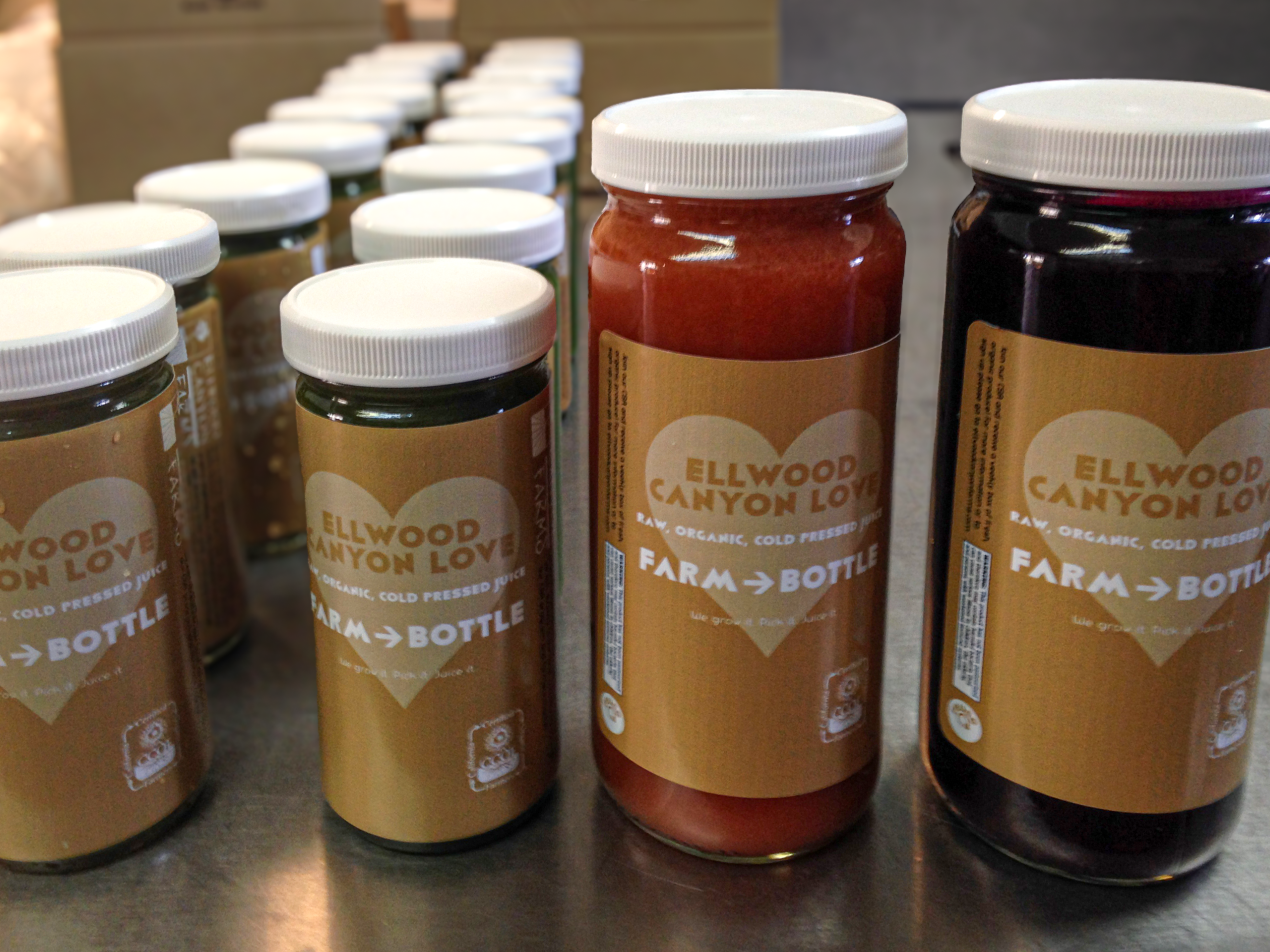
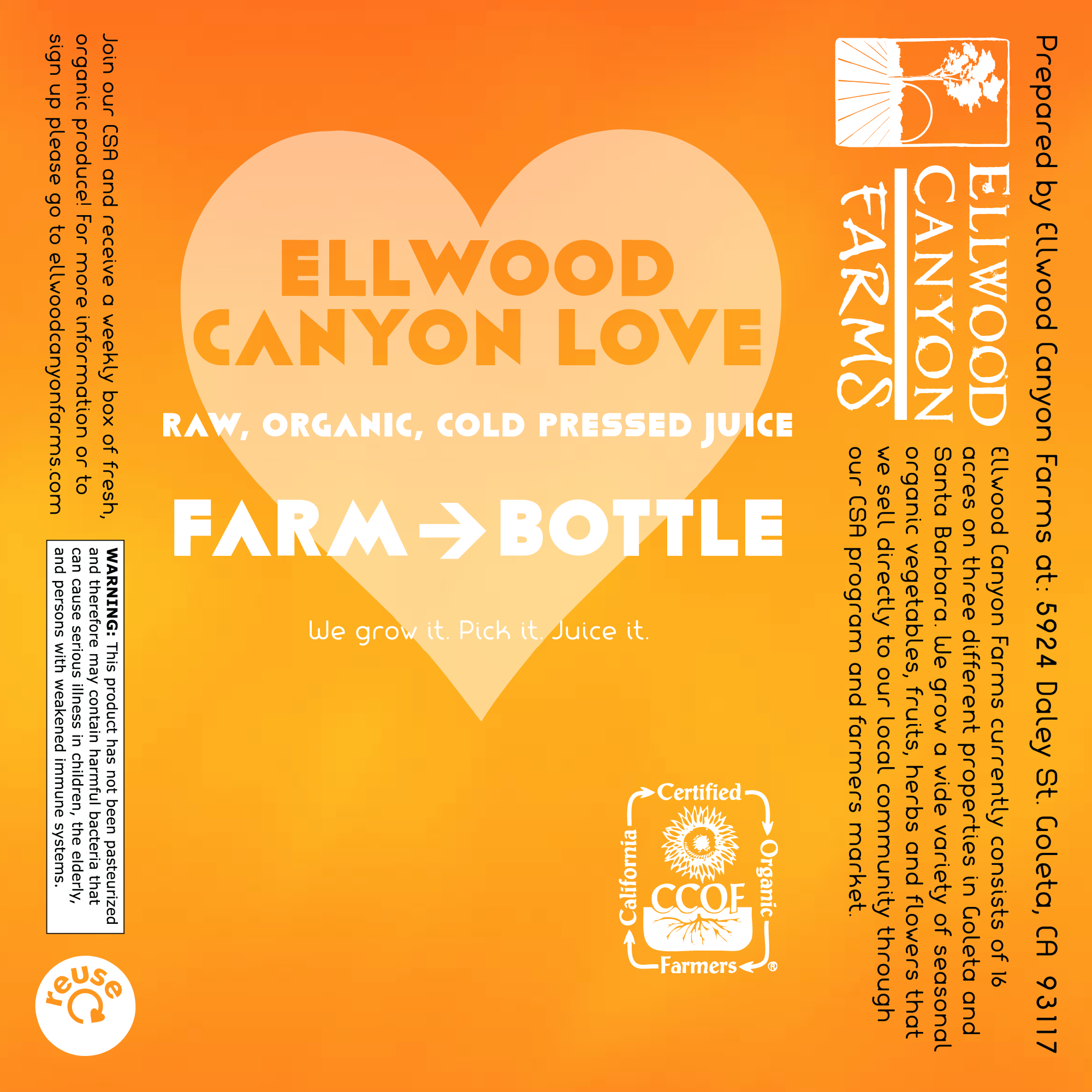
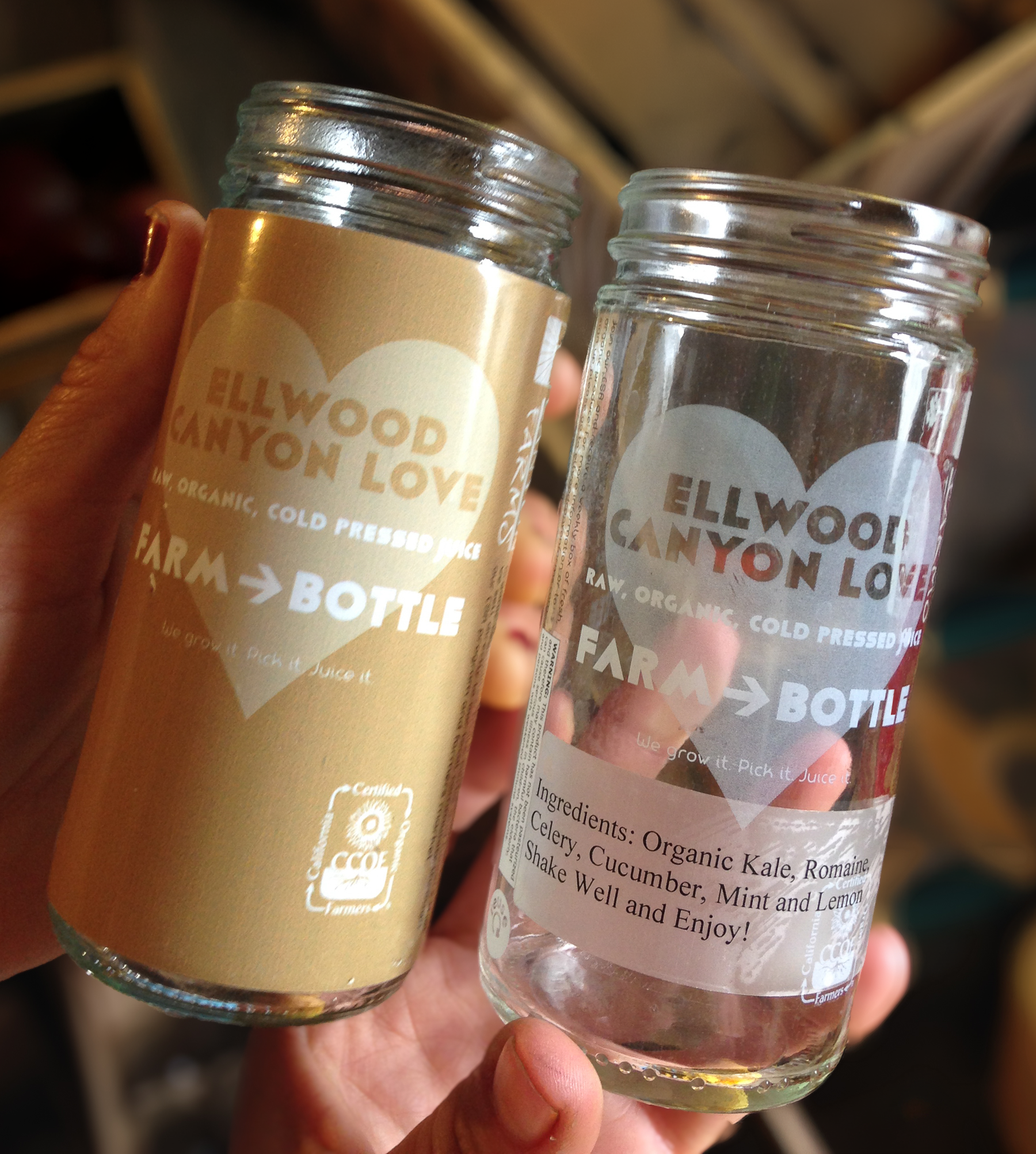
Challenge: Design new label system for cold pressed juice line, sold at farmers markets and through a farm CSA. Their previous label felt generic and didn’t reflect the farm’s own identity. The new labels needed to be simple to produce and swap out for many different juice flavors, while still building a consistent, recognizable identity that customers could spot at a glance across their farmers market stand and CSA offerings.
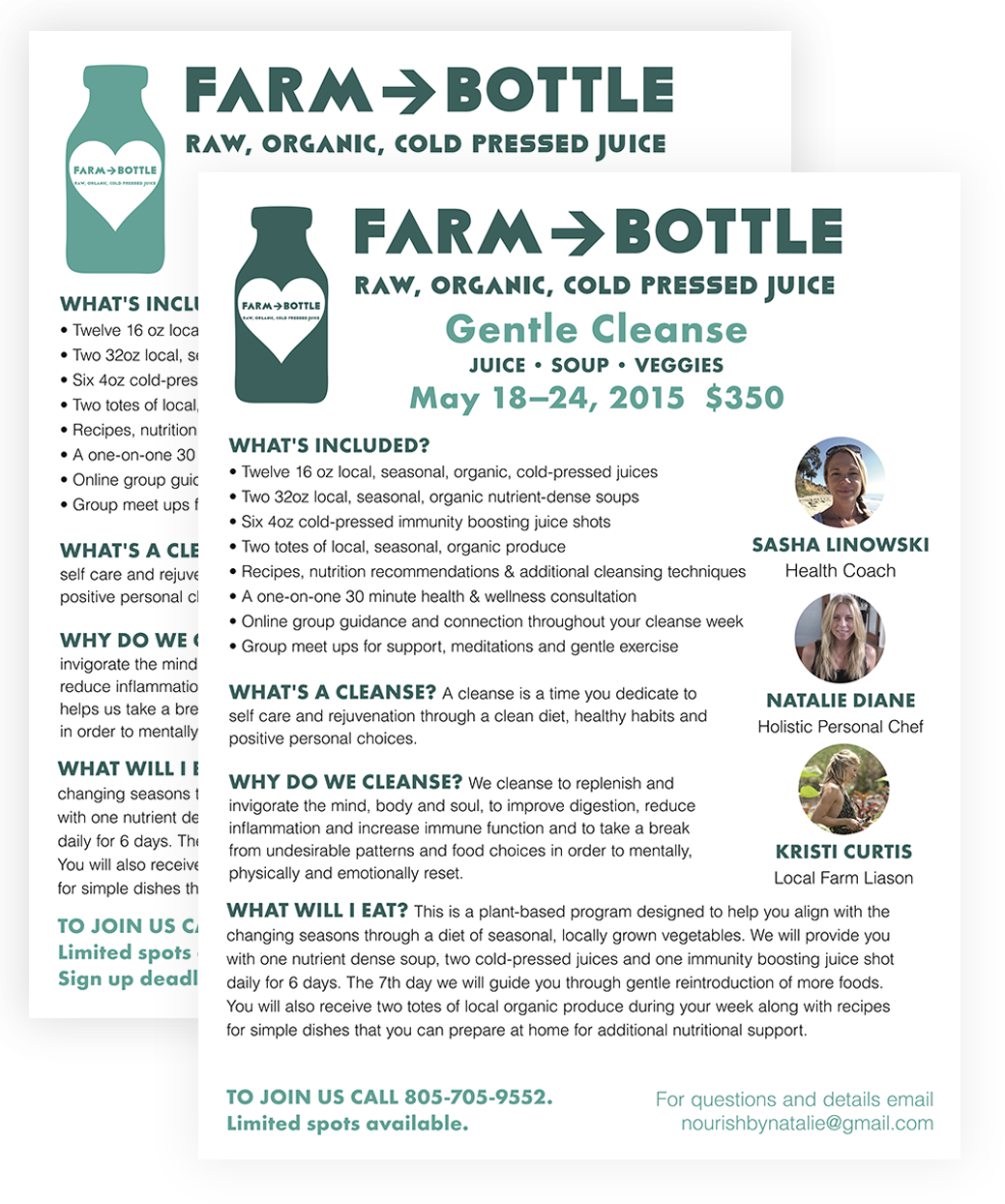
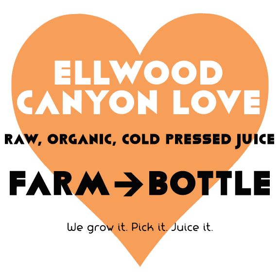
Solution: I designed a clean, bold label built around a heart icon and the name Ellwood Canyon Love, pairing the farm’s name with a warm, personal message about where the juice comes from. The layout kept flavor specific ingredient information separate and easy to update, while the heart, color, and Farm to Bottle tagline stayed consistent across every bottle, creating an identity customers could recognize no matter which juice they picked up. The design ended up working as more than just a label. Its bold, heart centered mark became a logo for the juice line, showing up on promotional flyers, market signage, and other branded materials beyond the bottle itself.
Tools: Illustrator